Blog

Posts written in 2020.

  • Published on
    -
    5 min read

    UniFi WiFi Router Is Really A Dream Machine!

    Ever since I’ve been forced to work from home over the last 3 months, I noticed in the first few weeks of the coronavirus lockdown my network performance has been subpar. Not ideal when a stable internet connection is ones only gateway to the outside world and enable you to work from home.

    My current network setup is quite simple and consists of:

    • ISP router - set to modem mode
    • Billion 7800DXL wireless router
    • Synology 4-bay NAS
    • Wireless Access Point
    • Wireless Security Camera

    The bottle-neck out of the whole setup is the Billion router. It’s not a basic router by any means and it has served me well since I last upgraded my network back in 2014. After being in use 24/7 over the last 6 years, signs of wear were starting to show. My internet connection would just randomly drop or wind to a halt. Carrying out a factory reset did not resolve the connection stability. Next step was to check for the latest firmware, but it seems that Billion has a really short firmware release cycle - not something you’d expect for a router costing just under £200. The last firmware was released in 2015, which I had already installed.

    I had to make a decision to either waste time on faffing around with the Billion router or look for a replacement. I decided on the latter.

    UniFi Dream Machine Router

    UniFi Dream Machine Boxed

    I knew straight-away what router I wanted to purchase - UniFi Dream Machine by Ubiquiti. I was sold on the name alone!

    Ubiquiti are known for making high-quality network solutions that are suitable for consumers and businesses alike. You can start off with a small setup based on your infrastructure needs knowing at a later point (if needed) you have the option to purchase additional hardware and upscale your network. From the reviews I’ve read online, the company really makes nice hardware that can seamlessly integrate with one another - part of the Ubiquiti eco-system.

    I was so tempted to go overkill on my new network set up just so I could do some additional tinkering, but the Dream Machine Router provides all the functionality I need and more.
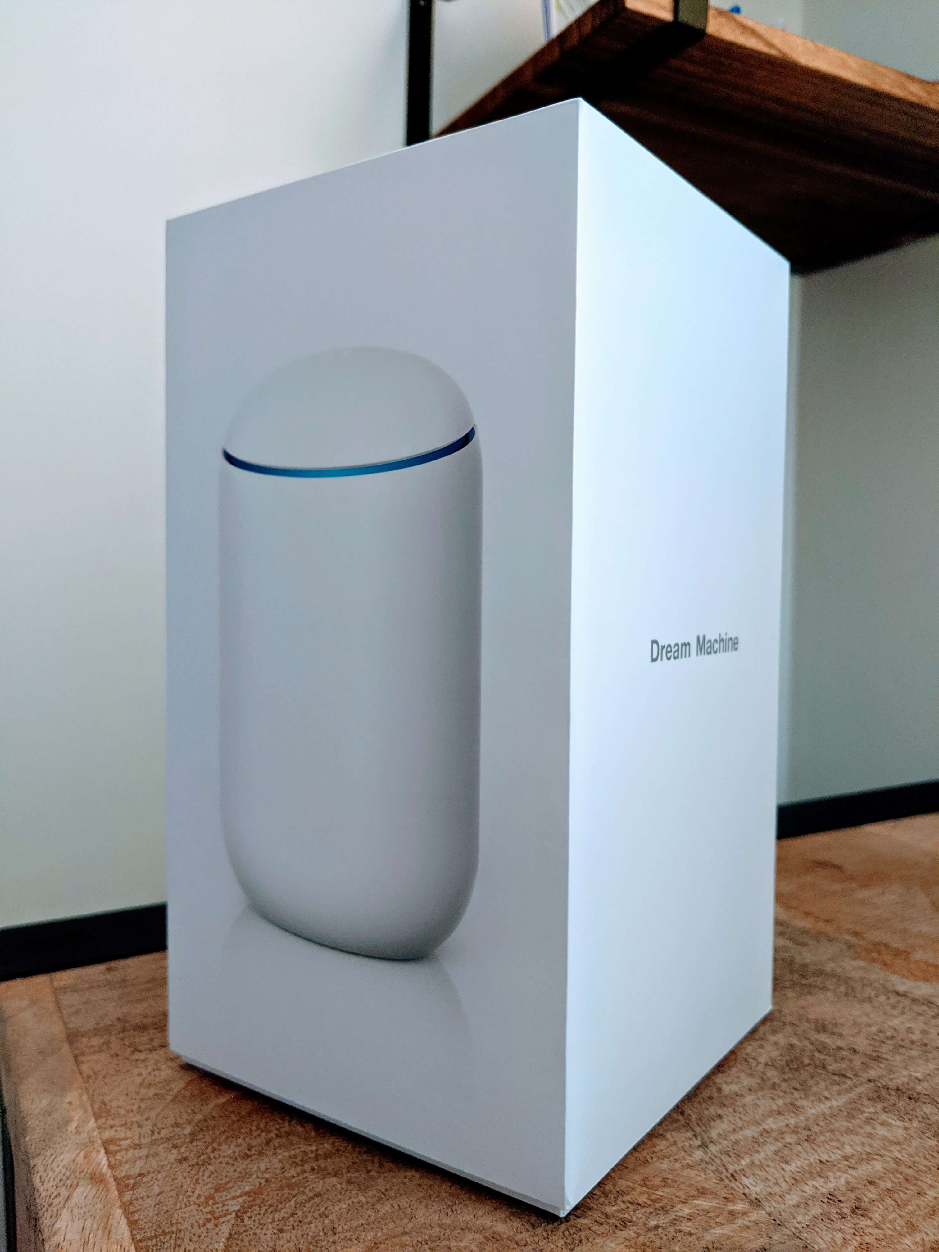
    Form Factor

    The Dream Machine isn’t like any other router I’ve purchased previously where the form factor has been a boring horizontal slab with two or three antennae poking out - a piece of hardware I would always hide away in my cabinet. But the Dream Machine is a nice looking piece of kit and even comes across very applesque. It can stand proud and upright in full view for all to see. Plus it has has a really cool blue ring light.

    It’s definitely heavier than any of my previous routers, which isn’t surprising from the amount of tech being crammed into this oversized mint tic tac, containing:

    • ARM Cortex Processor
    • Cooling Fan
    • 4 Port Gigabit Switch
    • Integrated Wireless Antenna 2.4/5GHz

    Setup

    I love the fact that from the moment you take the router out the box and connect to mains, you can literally get online and everything set up in no longer than 10 mins all from within the UniFi Network Controller mobile app. I don’t think I’ve ever been so excited to go through setting up a network device before. The mobile app makes things really simple that even my parents wouldn’t have a problem in carrying out the setup steps. I think I spent more time thinking about what I should call my wireless network. :-)

    I won’t go into too much detail here on the setup steps, but they consist of the following:

    • Find and connect to the device via Bluetooth.
    • Create a UI.com account, or login using your existing credentials.
    • Set auto-optimise settings.
    • Setup Wi-Fi network.
    • Set a firmware update schedule.
    • Perform network speed test to dial in with the speeds provided by your ISP.

    Once those steps are carried out, you just need to let the device go through its configuration process. Once complete, you can join the network wirelessly.

    If in the future, you decide to expand your network with additional UniFi devices, the setup process will be the same.

    “Prosumer” Configuration/Monitoring

    For a device that costs around £300, don’t think for one second the UniFi mobile app is the only route to making configuration changes. The mobile app is a protective bubble for the standard consumer who just wants a secure and reliable wireless setup without being too exposed to the inner workings. If I didn’t have a home NAS and didn’t feel the need to control how certain wireless access points could connect to devices, the mobile app would have more than sufficed.

    UniFi Network Controller App Home Screen

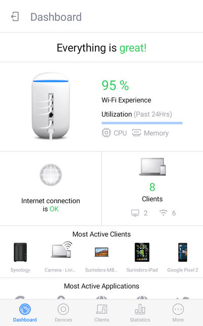
    Phew! The UniFi Network Controller App is telling me "Everything is great!".

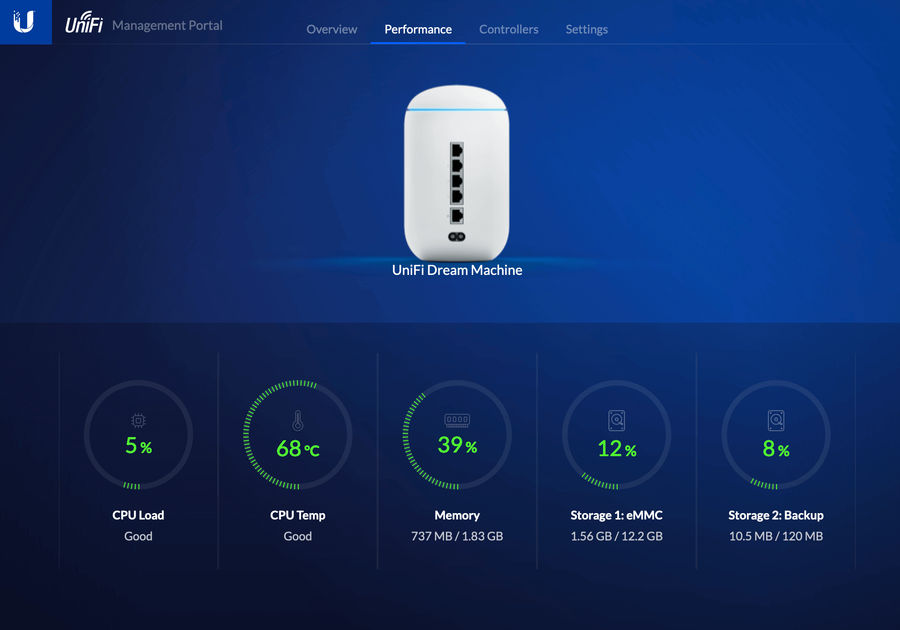
    I get a real kick out of seeing the vast array of network analytics and see how my internet usage has increased since working from home. You have at your disposal overall statistics on hardware performance, internet speed, threat maps, device and application usage to name a few.

    UniFi Traffic Stats

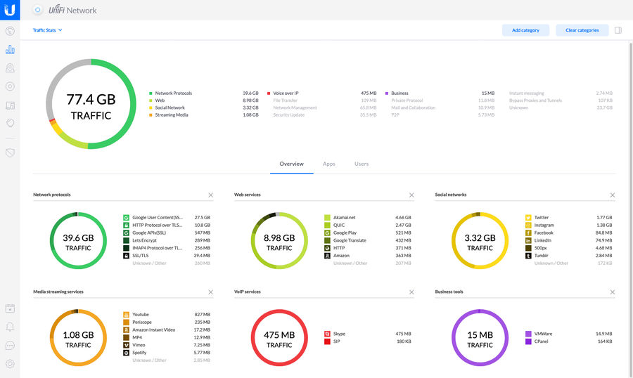
    If like me, you require more control over your network, this can be done by logging into the web interface, which is just as intuitive as the mobile app. Here I was able to configure port forwarding, network groups, firewall and guest network. Trust me, there is a tonne more configuration options you can change really easily making you feel like a network pro!

    UniFi Web Interface

    Security

    In addition to wanting a more stable and reliable network device, security also played a big factor in the reason why I purchased a Ubiquiti device.

    Unlike all the routers I’ve had in the past that probably only received 2-3 updates in their lifetime, Ubiquiti has turned that on its head. By just looking at their software release page, it’s a hive on activity. Up-to-date firmware enhances the longevity of the device by fixing any possible vulnerabilities as well as ensuring the device continues to function at its optimum level. To ensure you are always running the most up-to-date firmware, Ubiquiti have made the process very easy. The device will automatically install newly released firmware automatically based on your set schedule.

    There is also an option to enable Threat Management (currently in beta) that will protect your network from attacks, malware and malicious activity. Does this feature slow down the incoming traffic? The answer is no. The device has a whopping 850Mbps throughput limit. Amazing!

    Conclusion

    I purchased the Ubiquiti Dream Machine a couple of weeks into the start of the Covid-19 lockdown and I’m happy to report my network is more speedy then I could’ve hoped for. This is something you immediately notice when performing large file downloads/uploads. In fact, my parents log onto my Synology remotely and even they have noted an improvement.

    I’ll admit even after numerous research before making the purchase, I was still questioning whether spending such a large amount on a wireless router was worth it. But this concern was soon quashed knowing I have a piece of hardware that is more future-proof than what its competitors are currently offering and can later tie into a larger network architecture when needed.

    By buying this router you’ll be living the network dream!

  • I’ve been doing a little research into how I can make posts written in markdown more suited for my needs and decided to use this opportunity to develop my own Gatsby Markdown plugin. Ever since I moved to Gatsby, making my own Markdown plugin has been on my todo list as I wanted to see how I could render slightly different HTML markup based on the requirements of my blog post content.

    As this is my first markdown plugin, I thought it best to start small and tackle bug-bear of mine - making external links automatically open in a new window. From what I have looked online, some have suggested to just add an HTML anchor tag to the markdown as you will then have the ability to apply all attributes you’d want - including target. I’ll quote my previous post about aligning images in markdown and why I’m not keen on mixing HTML with markdown:

    HTML can be mingled alongside the markdown syntax... I wouldn't recommend this from a maintainability perspective. Markdown is platform-agnostic so your content is not tied to a specific platform. By adding HTML to markdown, you're instantly sacrificing the portability of your content.

    Setup

    We will need to create a local Gatsby plugin, which I’ve named gatsby-remark-auto-link-new-window. Ugly name... maybe you can come up with something more imaginative. :-)

    To register this to your Gatsby project, you will need start of with the following:

    • Creating a plugin folder at the root of your project (if one hasn’t been created already).
    • Add a new folder based on the name of our plugin, in this case - /plugins/gatsby-remark-auto-link-new-window.
    • Every plugin consists of two files:
      • index.js - where the plugin code to carry out our functionality will reside.
      • package.json - contains the details of our plugin, such as name, description, dependencies etc. For the moment this can just contain an empty JSON object {}. If we were to publish our plugin, this will need to be completed in its entirety.

    Now that we have our bare-bones structure, we need to register our local plugin by adding a reference to the gatsby-config.js file. Since this is a plugin to do with transforming markdown, the reference will be added inside the 'gatsby-transformer-remark options:

    {
      // ...
      resolve: 'gatsby-transformer-remark',
        options: {
          plugins: [        
            {
              resolve: 'gatsby-remark-embed-gist',
              options: {
                username: 'SurinderBhomra',
              },
            },
            {
              resolve: 'gatsby-remark-auto-link-new-window',
              options: {},
            },
            'gatsby-remark-prismjs',
          ],
        },
      // ...
    }
    

    For the moment, I’ve left the options field empty as we currently have no settings to pass to our plugin. This is something I will show in another blog post.

    To make sure we have registered our plugin with no errors, we need run our build using the gatsby clean && gatsby develop command. This command will always need to be run after every change made to the plugin. By adding gatsby clean, we ensure the build clears out all the previously built files prior to the next build process.

    Rewriting Links In Markdown

    As the plugin is relatively straight-forward, let’s go straight into the code that will be added to our index.js file.

    const visit = require("unist-util-visit")
    
    module.exports = ({ markdownAST }, pluginOptions) => {
      visit(markdownAST, "link", node => {
        // Check if link is external by checking if the "url" attribute starts with http.
        if (node.url.startsWith("http")) {
          if (!node.data) {
            // hProperties refers to the HTML attributes of the node in question.
            // Ensure this object is added to the node.
            node.data = { hProperties: {} };
          }
          
          // Assign the 'target' attribute.
          node.data.hProperties = Object.assign({}, node.data.hProperties, {
            target: "_blank",
          });
        }
      })
    
      return markdownAST
    }
    

    As you can see, I want to target all markdown link nodes and depending on the contents of the url property we will perform a custom transformation. If the url property starts with an "http" we will then add a new attribute, "target" using hProperties. hProperties refers to the HTML attributes of the targeted node.

    To see the changes take effect, we will need to re-run gatsby clean && gatsby develop.

    Now that we have understood the basics, we can beef up our plugin by adding some more functionality, such as plugin options. But that's for another post.

  • Published on
    -
    1 min read

    Aligning Images In Markdown

    Every post on this site is written in markdown since successfully moving over to GatsbyJS. Overall, the transition has been painless and found that writing blog posts using the markdown syntax is a lot more efficient than using a conventional WYSIWYG editor. I never noticed until making the move to markdown how fiddly those editors were as you sometimes needed to clean the generated markup at HTML level.

    Of course, all the efficiency of markdown does come at a minor cost in terms of flexibility. Out of the minor limitations, there was one I couldn't let pass. I needed to find a way to position images left, right and centre as majority of my previous posts have been formatted in this way. When going through the conversion process from HTML to markdown, all my posts were somewhat messed up and images were rendered 100% width.

    HTML can be mingled alongside the markdown syntax, so I do have an option to use the image tag and append styling. I wouldn't recommend this from a maintainability perspective. Markdown is platform-agnostic so your content is not tied to a specific platform. By adding HTML to markdown, you're instantly sacrificing the portability of your content.

    I found a more suitable approach would be to handle the image positioning by appending a hashed value to the end of the image URL. For example, #left, #right, or #centre. We can at CSS level target the src attribute of the image and position the image along with any additional styling based on the hashed value. Very neat!

    img[src*='#left'] {
    float: left;
    margin: 10px 10px 10px 0;
    }
    
    img[src*='#center'] {
    display: block;
    margin: 0 auto;
    }
    
    img[src*='#right'] {
    float: right;
    margin: 10px 0 10px 10px;
    }
    

    Being someone who doesn’t delve into front-end coding techniques as much as I used to, I am amazed at the type of things you can do within CSS. I’ve obviously come late to the more advanced CSS selectors party.

  • I decided to write this post to act primarily as a reminder to myself for when I'm publishing an ASP.NET Core project ready for a production environment. Most of the ASP.NET Core projects I'm currently working on are based on pre-existing client or platform-based boilerplates and when taking these on, they vary in quality and a result, some key project settings are just not implemented.

    I will be covering the following areas:

    • Ensuring the correct environment variable is set for your publish profile.
    • Setting custom error pages.
    • Switching between development and production appsetting.json files.

    Setting Environment In Publish Profile

    After you have created the publish profile, update the .pubxml file (found under the "/Properties/PublishProfiles" directory within your project) and add a EnvironmentName variable:

    <PropertyGroup>
        <EnvironmentName>Production</EnvironmentName>
    </PropertyGroup>
    

    This variable is very much key to the whole operation. Without it, the project will be stuck in development mode and the sections, listed below, will not work.

    Setting Custom Error Pages

    We are only interested in seeing a custom error page when in production mode. To do this, we need to:

    1. Update the Startup.cs file to enable status code error pages.
    2. Create an error controller to render the custom error pages.

    Startup.cs

    To serve our custom error page, we need to declare the route using the app.UseStatusCodePagesWithReExecute() method. This method includes a placeholder {0}, which will be replaced with the status code integer - 404, 500, etc. We can then render different views depending on the error code returned. For example:

    • /Error/404
    • /Error/500
    public void Configure(IApplicationBuilder app, IWebHostEnvironment env)
    {
        // Render full blown exception only if in development mode.
        if (env.IsDevelopment())
        {
            app.UseDeveloperExceptionPage();
        }
        else
        {
            app.UseStatusCodePagesWithReExecute("/Error/{0}");
            app.UseHsts();
        }
    }
    

    Error Controller

    Based on the status code returned, different views can be rendered.

    public class ErrorController : Controller
    {
        [ResponseCache(Duration = 0, Location = ResponseCacheLocation.None, NoStore = true)]
        [Route("/Error/{statusCode}")]
        public ViewResult Status(int statusCode)
        {
            if (statusCode == StatusCodes.Status404NotFound)
            {
                return View("~/Views/Error/NotFound.cshtml");
            }
            else
            {
                return View("~/Views/Error/GeneralError.cshtml");
            }
        }
    }
    

    Web.config

    Being a .NET Core project, there is one area that is easily overlooked as we're so focused on the Startup.cs and appsettings.json files - that is the web.config. We need to ensure the environment variable is set here also by adding the following:

    <environmentVariables>
        ...
        <environmentVariable name="ASPNETCORE_ENVIRONMENT" value="Production" />
        ...
    </environmentVariables>
    

    If the "ASPNETCORE_ENVIRONMENT" value isn't set correctly at this point, this will cause issues/inconsistencies globally.

    Switching To appsetting.production.json

    You've probably noticed that your ASP.NET Core project contains three appsettings.json files - each one for your environment:

    • appsettings.json
    • appsettings.development.json
    • appsettings.production.json

    If your ASP.NET Core project version is less than 3.0, you can switch between each appsettings.json file by adding the following code to your Startup.cs file:

    public void Configure(IApplicationBuilder app, IWebHostEnvironment env)
    {
        IConfigurationBuilder configBuilder = new ConfigurationBuilder()
            .SetBasePath(env.ContentRootPath)
            .AddJsonFile("appsettings.json", true, true)
            .AddJsonFile($"appsettings.{env.EnvironmentName}.json", true)
            .AddEnvironmentVariables();
    
        Configuration = configBuilder.Build();
    }
    

    However, if running on ASP.NET Core 3.0+, you will need to use WebHost.CreateDefaultBuilder(args) method that will be added to the Programs.cs file.

    public class Program
    {
        public static void Main(string[] args)
        {
            CreateHostBuilder(args).Build().Run();
        }
    
        public static IHostBuilder CreateHostBuilder(string[] args) =>
            Host.CreateDefaultBuilder(args)
                .UseContentRoot(Directory.GetCurrentDirectory())
                .ConfigureWebHostDefaults(webBuilder =>
                {
                    webBuilder.UseStartup<Startup>();
                });
    }
    

    The CreateDefaultBuilder performs the following environment-related tasks (to name a few):

    • Sets the content root to the path returned by Directory.GetCurrentDirectory().
    • Loads host configuration from environment variables prefixed with ASPNETCORE_ (for example, ASPNETCORE_ENVIRONMENT).
    • Loads application configuration settings in the following order, starting from appsettings.json and then appsettings.{Environment}.json.

    As you can see, from ASP.NET Core 3.0 onwards, quite a lot is being done for you from such a minimal amount of code.

  • Published on
    -
    3 min read

    Technical Blogging: Where Should I Be Writing?

    I’ve had this blog since 2007 when I had a bright idea to make a small mark on the internet. Back then, there weren’t many platforms to easily contribute ones technical thoughts freely in writing as there are now. All you really had were forums and a handful of other sites in the likes of 4GuysFromRolla.com, C# Corner and LearnASP.com (to name a few that come to mind). Now I could be wrong about the accuracy of this opening statement as 2007 was a long time ago - back in much simpler times when I was a Junior Web Developer.

    We have now come to a point where we’re spoilt for choice. There are multiple mediums where you have the freedom to publish your own technical writing in a more public and accessible way, the main ones being:

    • Medium
    • Dev.to
    • Hashnode.com
    • LinkedIn Articles

    At present, I post some of my writing to Medium whether that is a clone of my own blog content or new material specifically for the platform. However, I’m now rethinking where I should be publishing my content as I am now seeing more of my fellow developers on Twitter posting content to dev.to, when they previously used Medium.

    I really like dev.to found its approach to content curation to the developer community refreshing, which makes for very addictive reading and you can really see the passion in the writers. Should I start cross-posting there as well for more exposure? How does this affect things from an SEO standpoint where I have the same post on my blog as well as Medium and dev.to? All I know is anything I cross-post from my blog to Medium gets ranked higher in Google search results, which is to be expected.

    If I’m being honest to myself, I like posting content where I’m another small cog part of a wider community as there is a higher chance in like-minded individuals gaining access to your content and in the process get involved by commenting and imparting their knowledge on your written piece. You can’t help but feel rewarded when your article gets a like, clap or comment, which in return makes you want to do the same for other contributers. This doesn’t really happen on a personal website.

    When you are posting on another platform you don’t have to worry about technical issues or hosting. The only thing you need to do is write! But you have to remember that you’re writing in a platform that is not your own and any future changes will be out of your control.

    As great as these other writing platforms are, you are restricted in really seeing the developers personality, which is something that speaks volumes when viewing their personal website. They present their content in their own unique way and most importantly write about things freely that, otherwise, may not be within the parameters of a third-party platform.

    Final Thoughts

    As I’ve noted a shift in the number of technical posts being published to dev.to, I will more than likely do the same and cross-post any relevant content from my personal site. You can’t help but feel it’s the best place to get exposure to programming related content. Having said this, I still feel there’s is space for me to also cross-post to Medium. But what I won’t do is cross-post the same content to both. This feels counter-intuitive. Use the most appropriate platform that has the highest chance of targeting the readers based on the subject matter in hand.

    I don’t think I could ever stop writing within my own site as I like the freedom of expression - no strings attached. I can write about whatever I want and if there happens to be a post I’d like to also publish to the likes of either Medium or dev.to, I got the flexibility to do that as well.

  • Published on
    -
    3 min read

    Journey To GatsbyJS: We Are Live

    If you’re seeing this post, then this means I have fully made the transition to a static-generated website architecture using GatsbyJS. I started this process late December last year but then started taking it seriously into the new year. It’s been a learning process getting to grips with a new framework as well as a big jump for me and my site.

    Why has it been a big jump?

    Everything is static. I have downsized my website footprint exponentially. All 250+ blog posts have been migrated into markdown files, so from now on, I will be writing in markdown and (with the help of Netlify) pushing new content by a simple git commit. Until now, I have always had a website that used server-side frameworks that stored all my posts in a database. It’s quite scary moving to a framework that feels quite unnatural to how I would normally build sites and the word “static” when used in relation to a website reminds me of a bygone era.

    Process of Moving To Netlify

    I was pleasantly surprised by how easy the transition to Netlify was. There is a vast amount of resources available that makes for good reading before making the switch to live. After linking my website Bitbucket repository to a site, the only things left to do to make it live were the following:

    • Upload a _redirects file, listing out any redirects you require Netlify to handle. For GatsbyJS sites, this will need to be added to the /static directory.
    • Setup Environment variables to allow the application to easily switch between development and production states. For example, my robots.txt is set to be indexable when only in production mode.
    • Add CNAME records to your existing domain that point to your Netlify domain. For example, surindersite.netlify.com.
    • Issue a free Let’s Encrypt SSL certificate, which is easily done within the account Domain settings.

    Post live, the only thing that stumped me was the Netlify domain didn’t automatically redirect to my custom domain. This is something I thought Netlify would automatically handle once the domain records were updated. To get around this, an explicit domain 301 redirect needs to be added to your _redirects file.

    # Domain Redirect
    https://surinderbhomra.netlify.com/*     https://www.surinderbhomra.com/:splat    301!
    

    New Publishing Process

    Before making the switchover, I had to carry out some practice runs on how I would be updating my website just to be sure I could live with the new way of adding content. The process is now the following:

    1. Use “content/posts” branch to add a new blog post.
    2. Create a new .md file that consists of the date and slug. In my case, all my markdown files are named "2010-04-02---My-New-Post.md".
    3. Ensure all categories and tags in the markdown frontmatter is named correctly. This is an important step to ensure no unnecessary new categories or tags are created.
    4. Add any images used in the post to the site. The images should reference Imagekit.io.
    5. Check over the post locally.
    6. Push to master branch and let Netlify carry out the rest.

    Out of all the steps, I have only found steps 3 and 4 to require a little effort when compared to using a CMS platform, as previously, I could select from a predefined list of categories and upload images directly. Not a deal-breaker.

    Next Steps

    I had a tight deadline to ensure I made the move to Netlify before my current hosting renews for another year and still have quite a bit of improvement to make. Have you seen my Google Lighthouse score!?! It’s shockingly bad due to using the same HTML markup and CSS from my old site. I focused my efforts cramming in all the functionality to mimic how my site used to work and efficiencies in keeping build times to Netlify low.

    First thing on the list - rebuild website templates from the ground up.

  • Yesterday, I was frantically trying to debug why some documents weren’t getting returned when using the DocumentHelper.GetDocuments() method. Normally when this happens, I need delve deeper to see what SQL Kentico is generating via the API in order to get a little more information on where the querying could be going wrong. To do this, I perform a little “hacky” approach (purely for debugging) whereby I break the SQL within the API by insert a random character within the OrderBy or Where condition parameters.

    Voila! The can see the SQL in the error page.

    But it was only yesterday where I was shown a much more elegant solution by simply adding a GetFullQueryText() to your GetDocuments(), which then returns the SQL with all the parameters populated for you:

    string debugQuery = DocumentHelper.GetDocuments()
                                      .OnSite(SiteContext.CurrentSiteName)
                                      .Types(DocumentTypeHelper.GetClassNames(TreeProvider.ALL_CLASSNAMES))
                                      .Path("/", PathTypeEnum.Children)
                                      .Culture(LocalizationContext.PreferredCultureCode)
                                      .OrderBy("NodeLevel ASC", "NodeOrder ASC")
                                      .GetFullQueryText();
    

    I can’t believe I did not know this after so many years working on Kentico! How embarrassing...

  • For the Gatsby version of my website, currently in development, I am serving all my images from Imagekit.io - a global image CDN. The reasons for doing this is so I will have the ultimate flexibility in how images are used within my site, which didn’t necessarily fit with what Gatsby has to offer especially when it came to how I wanted to position images within blog post content served from markdown files.

    As I understand it, Gatsby Image has two methods of responsively resizing images:

    1. Fixed: Images that have a fixed width and height.
    2. Fluid: Images that stretch across a fluid container.

    In my blog posts, I like to align my images (just take look at my post about my time in the Maldives) as it helps break the post up a bit. I won’t be able to achieve that look by the options provided in Gatsby. It’ll look all a little bit too stacked. The only option is to serve my images from Imagekit.io, which in the grand scheme isn’t a bad idea. I get the benefit of being able to transform images on the fly, optimisation (that can be customised through Imagekit.io dashboard) and fast delivery through its content-delivery network.

    To meet my image requirements, I decided to develop a custom responsive image component that will perform the following:

    • Lazyload image when visible in viewport.
    • Ability to parse an array “srcset" sizes.
    • Set a default image width.
    • Render the image on page load in low resolution.

    React Visibility Sensor

    The component requires the use of "react-visibility-sensor” plugin to mimic the lazy loading functionality. The plugin notifies you when a component enters and exits the viewport. In our case, we only want the sensor to run once an image enters the viewport. By default, the sensor is always fired every time a block enters and exits the viewport, causing our image to constantly alternate between the small and large versions - something we don't want.

    Thanks for a useful post by Mark Oskon, he provided a solution that extends upon the react-visibility-sensor plugin and allows us to turn off the sensor after the first reveal. I ported the code from Mark's solution in a newly created component housed in "/core/visibility-sensor.js", which I then reference into my LazyloadImage component:

    import React, { Component } from "react";
    import PropTypes from "prop-types";
    import VSensor from "react-visibility-sensor";
    
    class VisibilitySensor extends Component {
      state = {
        active: true
      };
    
      render() {
        const { active } = this.state;
        const { once, children, ...theRest } = this.props;
        return (
          <VSensor
            active={active}
            onChange={isVisible =>
              once &&
              isVisible &&
              this.setState({ active: false })
            }
            {...theRest}
          >
            {({ isVisible }) => children({ isVisible })}
          </VSensor>
        );
      }
    }
    
    VisibilitySensor.propTypes = {
      once: PropTypes.bool,
      children: PropTypes.func.isRequired
    };
    
    VisibilitySensor.defaultProps = {
      once: false
    };
    
    export default VisibilitySensor;
    

    LazyloadImage Component

    import PropTypes from "prop-types";
    import React, { Component } from "react";
    import VisibilitySensor from "../core/visibility-sensor"
    
    class LazyloadImage extends Component {
        render() {
          let srcSetAttributeValue = "";
          let sanitiseImageSrc = this.props.src.replace(" ", "%20");
    
          // Iterate through the array of values from the "srcsetSizes" array property.
          if (this.props.srcsetSizes !== undefined && this.props.srcsetSizes.length > 0) {
            for (let i = 0; i < this.props.srcsetSizes.length; i++) {
              srcSetAttributeValue += `${sanitiseImageSrc}?tr=w-${this.props.srcsetSizes[i].imageWidth} ${this.props.srcsetSizes[i].viewPortWidth}w`;
    
              if (this.props.srcsetSizes.length - 1 !== i) {
                srcSetAttributeValue += ", ";
              }
            }
          }
    
          return (
              <VisibilitySensor key={sanitiseImageSrc} delayedCall={true} partialVisibility={true} once>
                {({isVisible}) =>
                <>
                  {isVisible ? 
                    <img src={`${sanitiseImageSrc}?tr=w-${this.props.widthPx}`} 
                          alt={this.props.alt}
                          sizes={this.props.sizes}
                          srcSet={srcSetAttributeValue} /> : 
                    <img src={`${sanitiseImageSrc}?tr=w-${this.props.defaultWidthPx}`} 
                          alt={this.props.alt} />}
                  </>
                }
              </VisibilitySensor>
          )
        }
    }
    
    LazyloadImage.propTypes = {
      alt: PropTypes.string,
      defaultWidthPx: PropTypes.number,
      sizes: PropTypes.string,
      src: PropTypes.string,
      srcsetSizes: PropTypes.arrayOf(
        PropTypes.shape({
          imageWidth: PropTypes.number,
          viewPortWidth: PropTypes.number
        })
      ),
      widthPx: PropTypes.number
    }
    
    LazyloadImage.defaultProps = {
      alt: ``,
      defaultWidthPx: 50,
      sizes: `50vw`,
      src: ``,
      widthPx: 50
    }
    
    export default LazyloadImage
    

    Component In Use

    The example below shows the LazyloadImage component used to serve a logo that will serve a different sized image with the following widths - 400, 300 and 200.

    <LazyloadImage 
                    src="https://ik.imagekit.io/surinderbhomra/Pages/logo-me.jpg" 
                    widthPx={400} 
                    srcsetSizes={[{ imageWidth: 400, viewPortWidth: 992 }, { imageWidth: 300, viewPortWidth: 768 }, { imageWidth: 200, viewPortWidth: 500 }]}
                    alt="Surinder Logo" />
    

    Useful Links

    https://alligator.io/react/components-viewport-react-visibility-sensor/ https://imagekit.io/blog/lazy-loading-images-complete-guide/ https://www.sitepoint.com/how-to-build-responsive-images-with-srcset/

  • Published on
    -
    2 min read

    Journey To GatsbyJS: Beta Site Release v2

    It’s taken me a little longer to make more progress as I’ve been stumped on how I would go about listing blog posts filtered by year and/or month. I’ve put extra effort in ensuring the full date is included in the URL for all my blog posts. In the process of doing this, I had to review and refactor the functions used within gatsby-node.js.

    Refactoring

    I noticed that I was carrying out build operations inefficiently and in some cases where they didn’t need to happen. For example, I was building individual blog post pages all over the place thinking I was required to do this in areas where I was listing blog posts. Reviewing my build operations had a positive impact and managed to reduce build times to Netlify from 2 minutes 17 seconds to 2 minutes 3 seconds. Where you are able to make build time savings, why wouldn’t you want to do this? By being efficient, you could squeeze in more builds within Netlify’s 300-minute monthly limit (based on free-tier).

    Page Speed Tests

    The GatsyJS build is at a point where I can start carrying out some performance tests using Google Page Insights and Lighthouse. Overall, the tests have proved more favourable when compared against my current site. The Lighthouse analysis still proves there is work to be done, however, the static-site generator architecture sets you off to a good start with minimal effort.

    Google Lighthouse Stats - Current Site Current site

    Google Lighthouse Stats - Gatsby Site Gatsby site

    Current HTML/CSS Quality

    I can see the main area of failure is the HTML and CSS build... not my strong suit. The template has inherited performance-lag remnants from my current site and even though I have cleaned it up as well as I can, it’s not ideal. At this moment, I have to focus on function over form.

    Site Release Details

    This version contains the following:

    • Blog post-filtering by year and/or month. For example:
      • /Blog/2019
        • /Blog/2019/12
    • Refactored build functions.
    • Removed unneeded CSS from the old template (still got more to do).

    GatsbyJS Beta Site: http://surinderbhomra.netlify.com

  • There will be times where you will want to customise the slug based on fields from your markdown file. In my case, I wanted all my blog post URL's in the following format: /Blog/yyyy/MM/dd/Blog-Post-Title. There are two ways of doing this:

    1. Enter the full slug using a “slug” field within your markdown file.
    2. Use the onCreateNode() function found in the gatsby-node.js file to dynamically generate the slug.

    My preference would be option 2 as it gives us the flexibility to modify the slug structure in one place when required. If for some reason we had to update our slug structure at a later date, it would be very time consuming (depending on how many markdown files you have) to update the slug field within each markdown file if we went ahead with option 1.

    This post is suited for those who are storing their content using markdown files. I don’t think you will get much benefit if your Gatsby site is linked to a headless CMS, as the slugs are automatically generated within the platform.

    The onCreateNode() Function

    This function is called whenever a node is created or updated, which makes it the most ideal place to add the functionality we want to perform. It is found in the gatsby-node.js file

    What we need to do is retrieve the fields we would like to form part of our slug by accessing the nodes frontmatter. In our case, all we require is two fields:

    1. Post Date
    2. Slug
    exports.onCreateNode = ({ node, actions, getNode }) => {
        const { createNodeField } = actions
      
        if (node.internal.type === `MarkdownRemark`) {
          const relativeFilePath = createFilePath({ node, getNode, trailingSlash: false });
          const postDate = moment(node.frontmatter.date); // Use moment.js to easily change date format.
          const url = `/Blog/${postDate.format("YYYY/MM/DD")}${node.frontmatter.slug}`;
    
          createNodeField({
            name: `slug`,
            node,
            value: url,
          });
        }
      }
    

    After making this change, you will need to re-run the gatsby develop command.